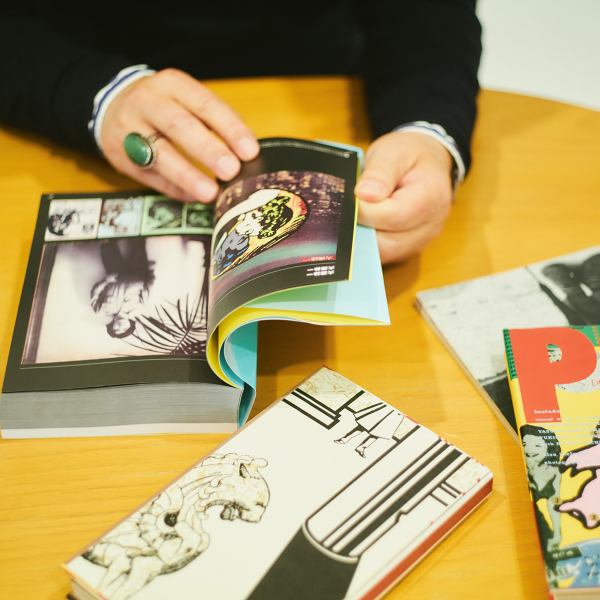
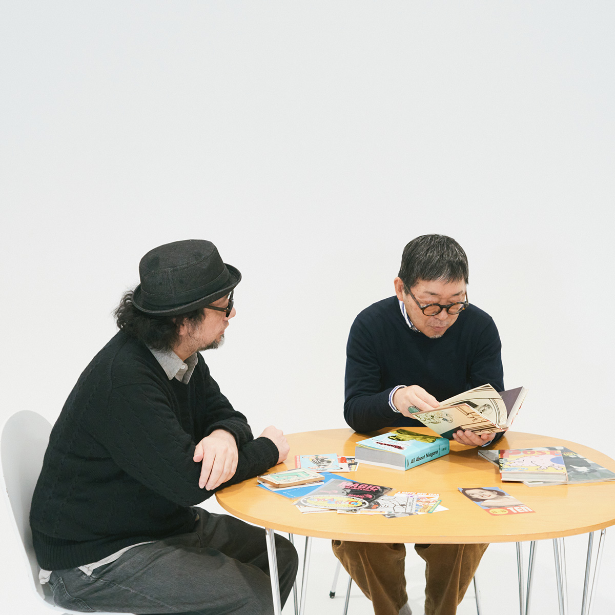
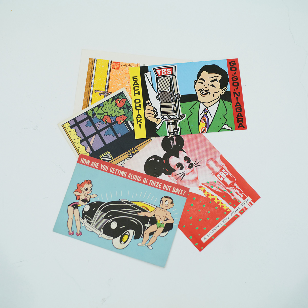
All of Nakayama Yasushi's works are so well-finished that Eiichi Ohtaki once said, "The first thing I encountered was the final draft." His work is not limited to the Niagara label; it spans a wide range of genres, from the jackets of classic Japanese rock albums like Tadashi Kosaka's "Arigato," to book designs, postcards, and flyers, and he has been a driving force behind Japan's graphic design scene since 1970. With Nakayama Yasushi's works, filled with American culture, spread out across a desk, the two began by talking about how they first met.
Takashi Okada
My first encounter with Nakayama-san was working on the 40th anniversary of the Niagara label. In fact, I never got to meet him. During a meeting at Niagara, I said to him, "I haven't met you yet, so I'd like to meet you," and we agreed to arrange a meeting at some point, but he passed away in 2020, so I never got to meet him.
Hitoshi Okamoto
I didn't even know that he had passed away until I heard about this. I looked into whether Nakayama-san would be attending today's talk, and was surprised to find out that he had passed away.
Okada
He passed away at the end of August, so this year marks the fifth anniversary of his death. In 2004, I produced the "Happy End BOX" with Masayuki Kawakatsu, a booklet full of text, mainly consisting of interviews with band members and related parties.
Then, in 2014, I produced the booklet for "Happy End Masterpiece," and with the help of Niagara Enterprises' Osamu Sakaguchi, I established a presentation style that mainly featured visuals such as the master tapes, track sheets, and handwritten lyrics from that time, and that led to me being in charge of the 40th anniversary edition of "NIAGARA MOON." Since then, I've been in charge of the design of the "Niagara" works that are released every year on March 21st.
I worked with Nakayama on three albums: the 2018 Eiichi Ohtaki Collection Vol. 3 "If We Meet in Our Dreams," the album "GO! GO! ARAGAIN," in which young musicians known as the next generation attempted to cover Ohtaki's songs, and the 2020 album "Happy Ending," for which I was in charge of the overall design based on the cover jackets that Nakayama designed.
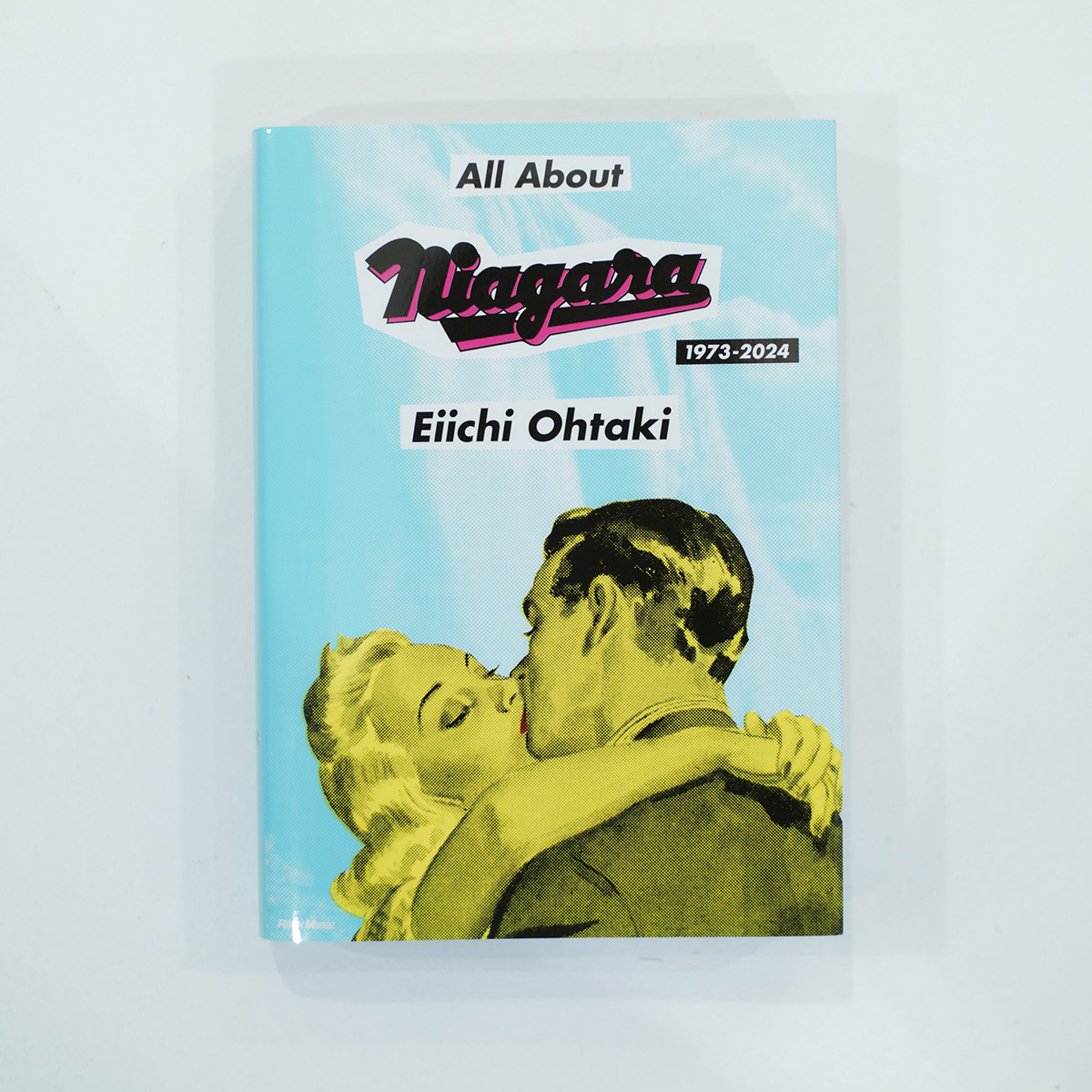
"All About Niagara 1973-2024," released this year, was created based on Nakayama's design data from "NIAGARA CD BOOK II," released in 2015, which we still had available.
Okamoto
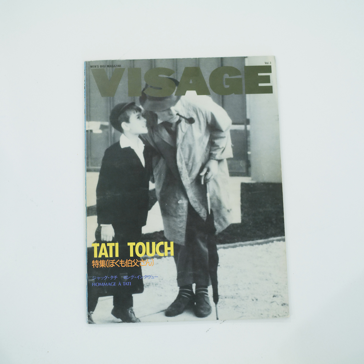
I was editing a magazine called "VISAGE" published by Men's Bigi under the name of Ono Ikuo in 1989, and I asked him to do some illustrations for it, which was probably our first encounter. That was also an idea suggested by Konishi Yasuharu.
I had seen Nakayama's jacket designs and other works, but at the time I didn't really care who drew or designed them, so it felt like a lot of things started coming together at that time.
I actually knew his wife, Umika Suzuki, better because I learned that she was the editor of Light Music, a magazine I read often at the time.
Okada
What part of Nakayama's work has left the biggest impression on you?
Okamoto
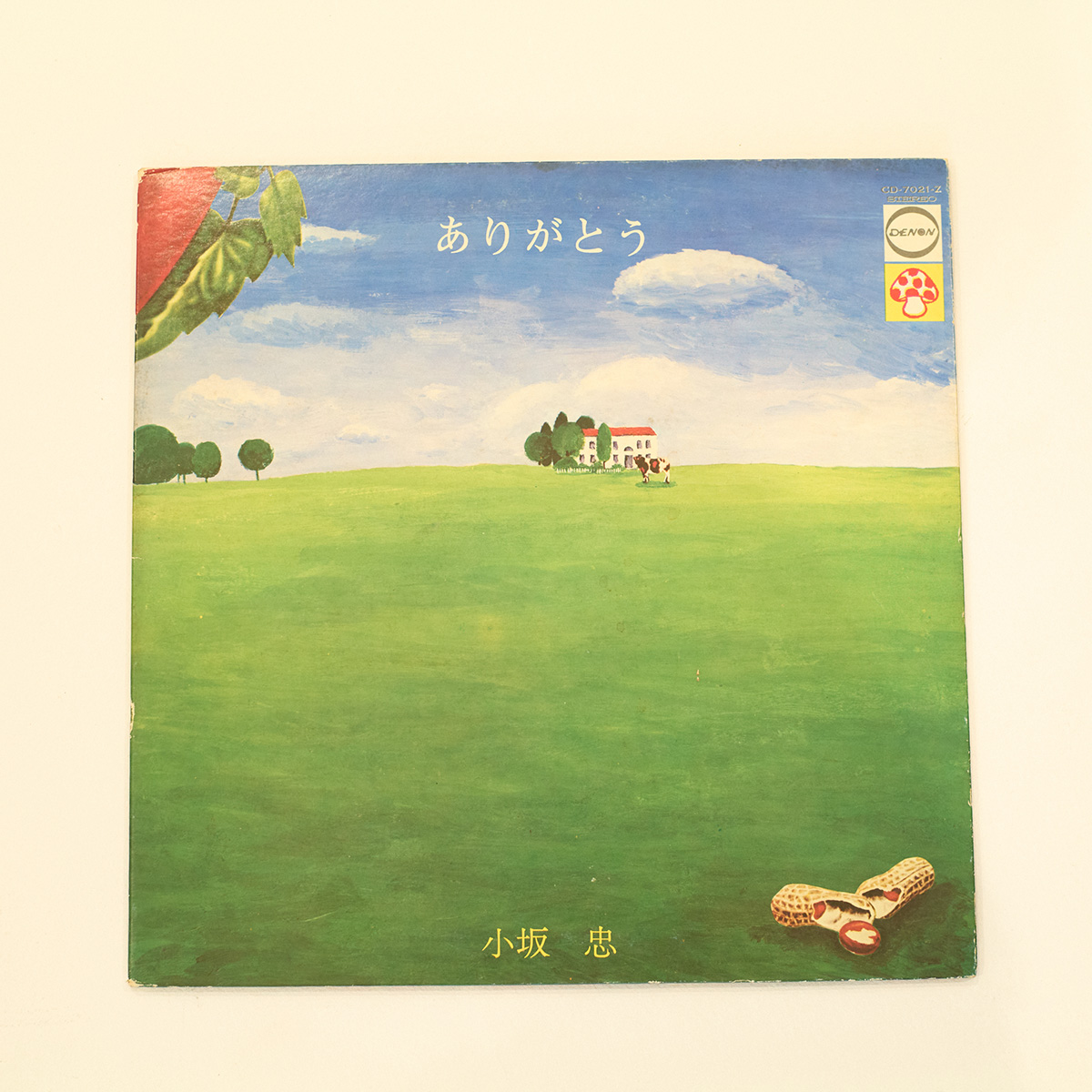
When I think of Nakayama's work, it's probably Eiichi Ohtaki's first album and Tadashi Kosaka's "Arigato" (both art directed by WORKSHOP MU!!). I've forgotten which came first, though. I always thought that the illustrations for "Arigato" were by Nobuhiko Yabuki, so he really is a terrible editor (laughs).
Okada
For me, it's Niagara in general in the 1970s. When I was in the first year of junior high school, on the same day that I bought Haruomi Hosono 's "Stairs to the Horizon," a friend of mine bought the first edition of "All About Niagara 1973-1979" (1982, Hachiyosha) and showed it to me. After that, I never thought I'd end up working on the sequel, "All About Niagara 1973-2024."
Okamoto
How did you feel when you heard about the role?
Okada
Well, I thought, "That sounds like a lot of work" (laughs). Of course I was happy and surprised, but first of all, it seemed like a lot of work. In fact, it was difficult in terms of both design and work. I had to scan over 2,200 items and lay them out myself, so that alone took nearly six months... It was beyond the realm of a designer (laughs).
When people think of Otaki, they probably think of Nagai Hiroshi's "A LONG VACATION" (hereafter "Long Vacation"), but when you look at "All About Niagara 1973-2024," the Niagara color created by Nakayama is very strong.
Okamoto
I actually got my hands on "Long Vacation" in '91 or '92, 10 years after it was released. I found it at a flea market in Kamakura and realized I didn't have it, so I think I bought it for 500 yen. Of course, I had heard it on the radio and stuff, but that was the first time I'd really listened to it... It's a long story, so I'll stop here (laughs).
Okada
I didn't buy it in real time either. I believe "Long Vacation" and YMO's "BGM" were released on the same day (March 21, 1981). Normally, you don't listen to "Long Vacation" and "BGM" together, do you? (laughs) I was a YMO fan back then, and I was interested in Okumura Yukimasa's designs, so it was much later that I listened to them.
A creation strongly influenced by pop art that clearly expresses the music of the Niagara label.
Okamoto
(Flipping through the pages of "All About Niagara 1973-2024") Looking at it again, I've seen almost everything before. It's amazing how even though it took me 10 years to listen to "Long Vacation," I still recognize most of the covers.
Okada
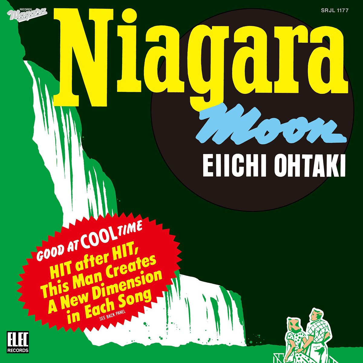
It really expresses Otaki's music. I think "NIAGARA MOON" is a perfect example of the level of perfection that would have been impossible to imagine at the launch of the Niagara label. It's well-known that it was inspired by a real laundry starch package, but given the era, it was probably influenced by pop art, and was designed with a similar feel to (Andy) Warhol's Campbell's Soup Cans or Brillo Boxes.
Okamoto
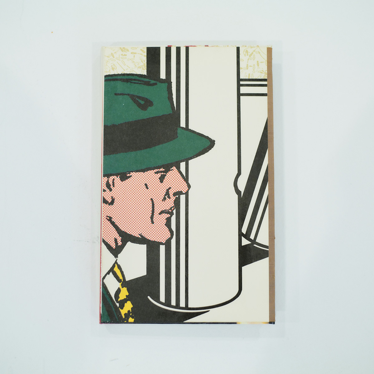
The extensive use of halftone dots (a collection of small dots used to express the shades of light and dark in a printed material) is reminiscent of Lichtenstein, and the work is filled with the America of the time, when everything would have sparkled.
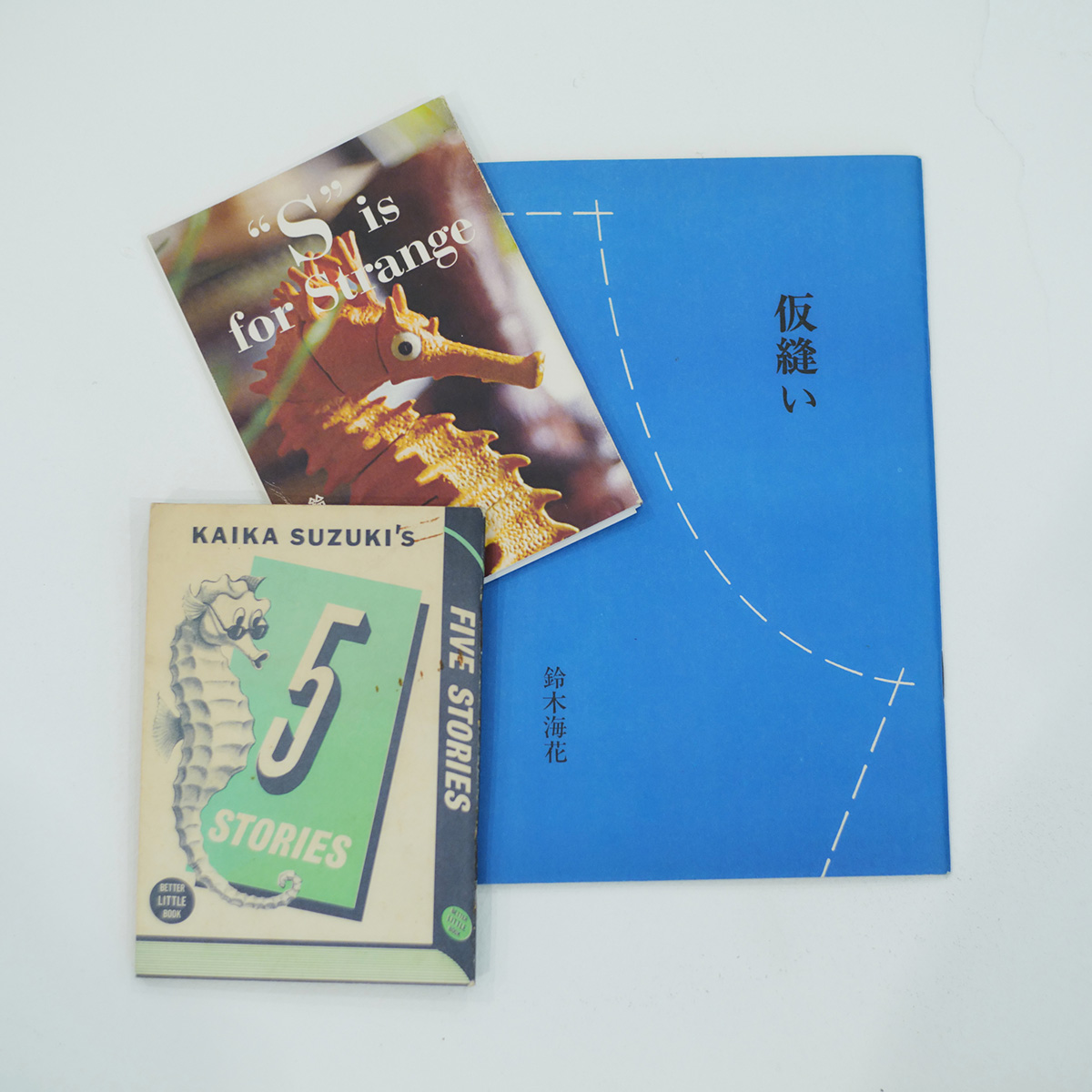
For "VISAGE," I only asked him to do the illustrations, so there was no interaction like there was with the jacket design, but Konishi-kun, who recommended the Nakayama x Suzuki duo, showed me the double-tone design of Suzuki Umika's booklet "Kissui," which was designed by Nakayama, and thinking about it now, I may have unconsciously followed that design for "VISAGE."
By the way, this was my first time seeing "Dream of Life," and I didn't quite understand why Nakayama and Okumura Yukimasa were on the same design team (WORKSHOP MU!!), but when I saw this book, it all made sense. Anyway, I had the impression that everyone in that unit had such strong personalities that they couldn't come together. Come to think of it, the jacket for "Arigatou" was also a collaboration between the three of them.
Okada
Around 1970, when WORKSHOP MU!! was born, Japan's graphic design world was also undergoing a period of change. The Japan Advertising Art Association, which had been a driving force behind the postwar design world, was disbanding, and it was perhaps a natural progression for Nakayama and others with a new sensibility to create MU!! and begin their activities.
100% Studio, founded by Teruhiko Yumura, Nobuhiko Yabuki, and Yosuke Kawamura, was also established around the same time. I think they were inspired by Push Pin Studios in New York, which had been very active since the 1960s.
Hipgnosis, a design group formed in the UK around the same time as MU!!, was recently made into a film, but their influence isn't particularly apparent. And there's almost no hint of drugs in Nakayama's work.
Okamoto
That being said, these artworks are hypnotically devoid of artist names, and it doesn't feel like they're intended to be sold at all (laughs). They are barely included on the obi, though.
Okada
I think this was possible because Mushroom Records was the first indie label in Japan. On the other hand, Niagara Label must have been trying to maintain a corporate image.
Okamoto
The label logo alone makes it look great on a record.
The meetings about the new album were just chatting. I don't think we even listened to the recording.
--At this point, Niagara Enterprises President Osamu Sakaguchi joins the conversation.
Osamu Sakaguchi
They both loved baseball, so I guess they got the idea from the uniforms of MLB teams like the Dodgers. When we had meetings to make a new album, neither Otaki nor Nakayama talked about the content. They just chatted and were like, "I'll leave the rest to you." At worst, they might have only talked about the title and concept, and not even listened to the recording (laughs).
Okada
I think Nakayama was probably thinking about how he could surprise Otaki without showing him the progress along the way.
Sakaguchi
We were close in age and shared a common desire to go to America, so I'm sure he trusted me.
Okada
Nakayama-san is known for his halftone dots. It was also difficult when he was making "All About Niagara 1973-2024." Too many halftone dots can lead to moiré (striped patterns caused by interference between halftone dots). To avoid this, we used high-resolution printing with 1.5 to 2 times the usual number of halftone dots.
Okamoto
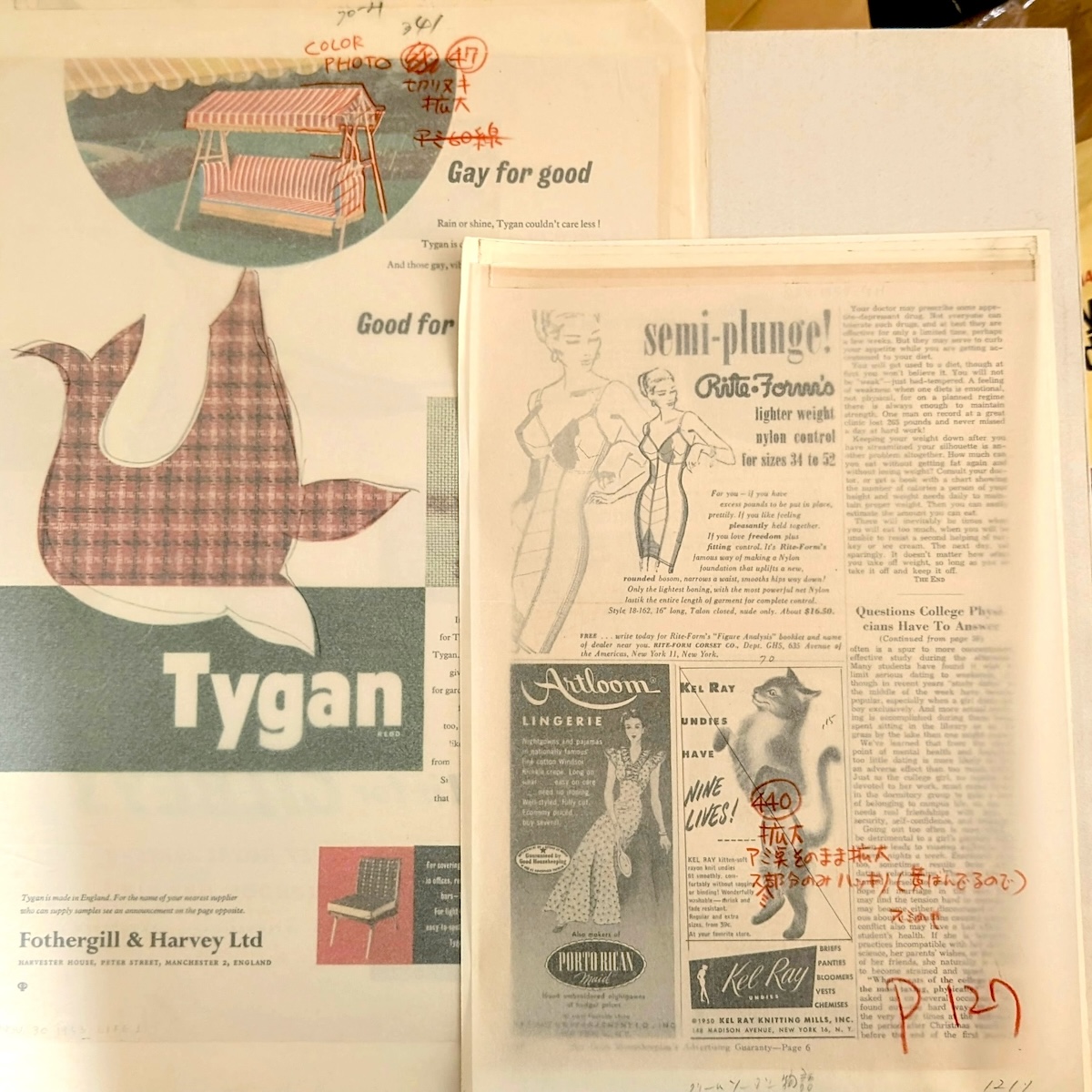
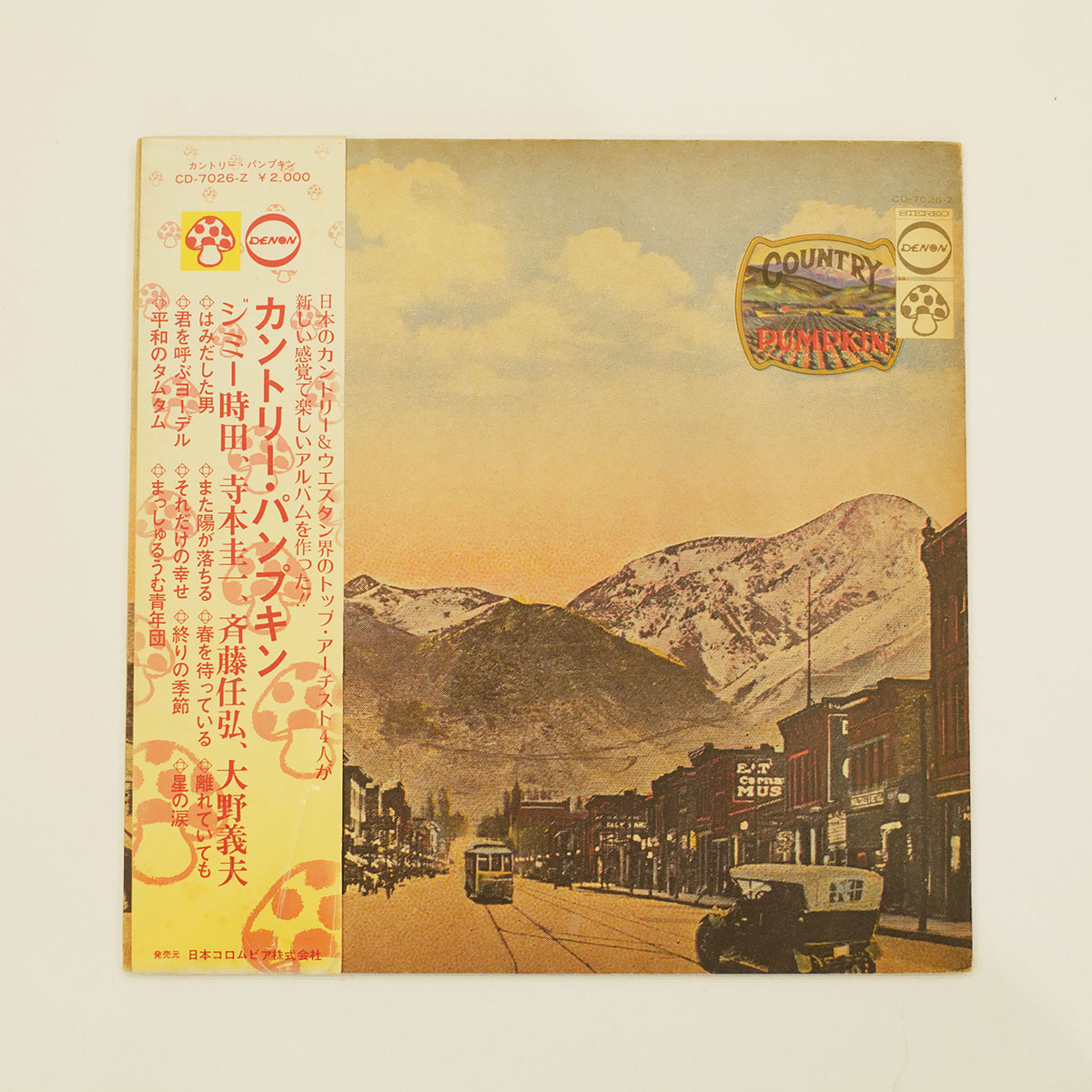
To begin with, they were collaging by defacement of printed materials, and the paper was often worn out, so the printers probably felt it was a bit strange to spend money on a rough finish. The jacket for "Country Pumpkin" was probably inspired by an old, artificially colored postcard.
Okada
The original sources were magazines, postcards, and other printed materials, so the halftone dots became the style. It also has a pop art feel like (Roy) Lichtenstein.
Okamoto
What did you actually focus on when working on Nakayama's works?
Okada
We want to do our best to preserve the image of that time.
For example, for the 40th anniversary edition of "NIAGARA MOON," instead of scanning the original jacket and printing it as is, we separated the colors in Photoshop based on the scanned data, reproduced the monochrome design plate that Nakayama probably created at the time on a layer, and then used a magnifying glass to mark the color specifications and color it again.
It can be tricky because the colors of printing inks used in the 70s and today are slightly different, but I worked with the goal of reproducing it using modern printing in mind. It's like a remaster of the design. The sound has also been remastered to the latest version, so the jacket too (laughs).
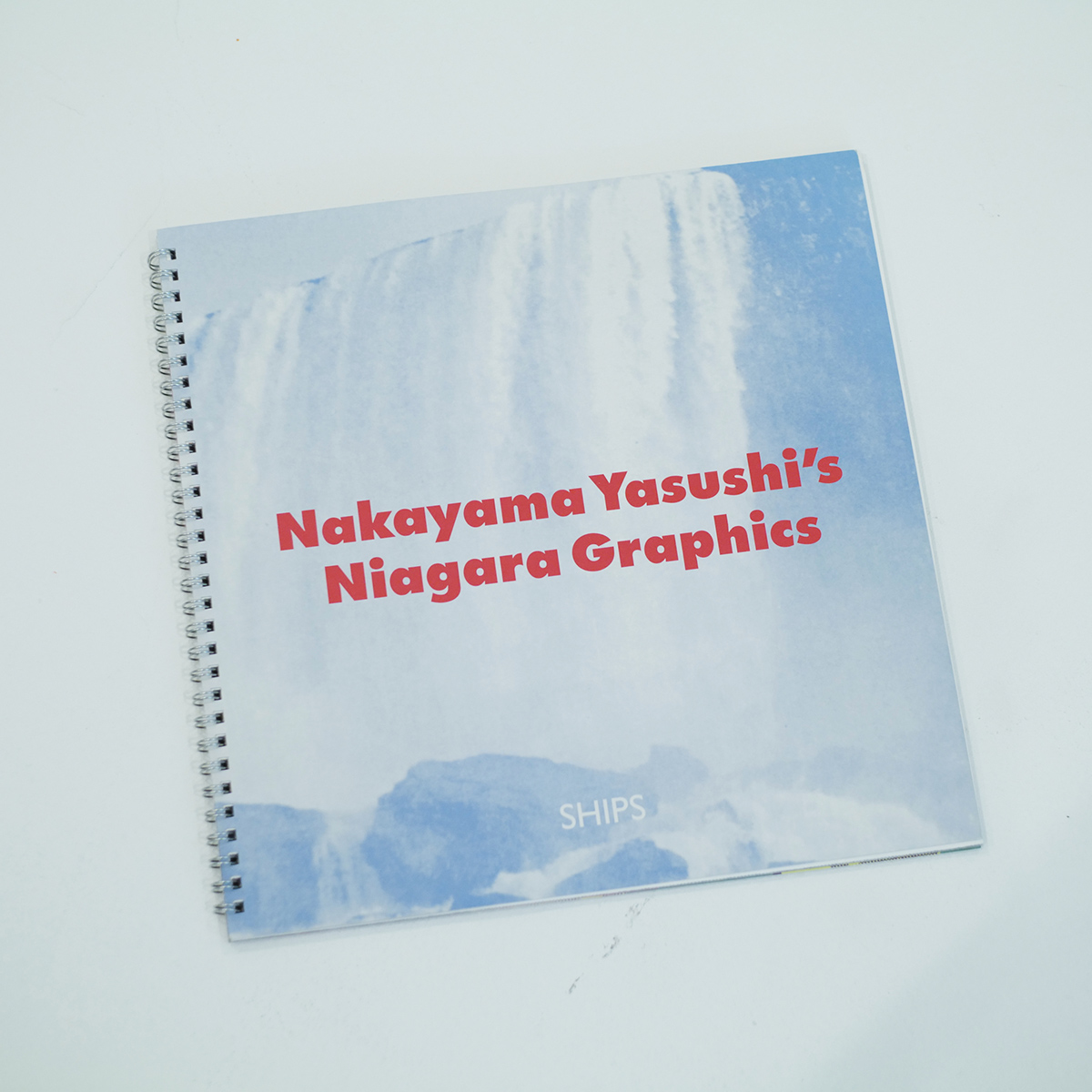
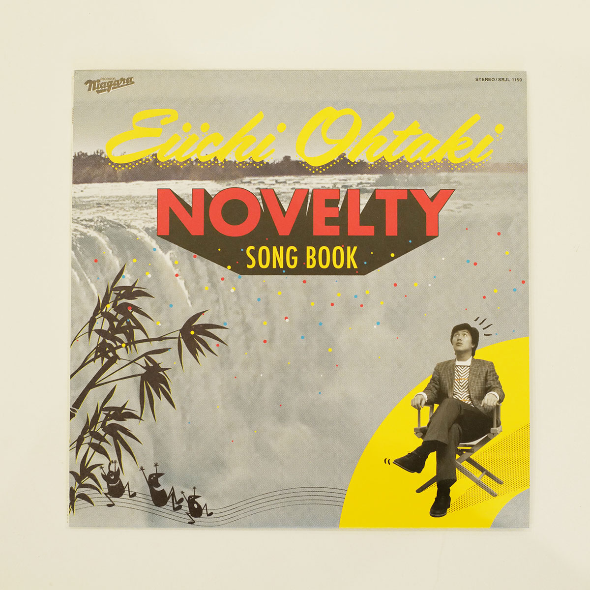
I designed this "NOVELTY SONG BOOK" while daydreaming about how Nakayama would create it, and following Nakayama's example, I started by looking for a photo of Niagara Falls. I also experimented with the halftone dots I mentioned earlier. Since "Grandpa Harikiri's Rock 'n' Roll" is included, I had some fun incorporating an illustration of the alien that appears on the cover of the single "Aliens Dancing Rock" by Chev Woolery, which is the original song (laughs).
When Nakayama designed the cover for "GO! GO! ARAGAIN," a collection of covers of Eiichi Ohtaki's songs by young musicians, he created a cover similar to the self-cover for "GO! GO! NIAGARA," but the lines are completely different compared to his older work. It was drawn with illustrator's Bezier curves, which is the difference between hand-drawn and digital, but it felt a little too neat. It's not so noticeable on a CD, but it is on an LP size. Looking at the work again, I sometimes wonder if it would have been better to use a rougher treatment like that.
Okamoto
In the end, it was just because it was done by hand at the time, but I think Nakayama himself wanted to do it nicely. Just like the younger generation who thinks letterpress is good, I think if he had lived in the era of letterpress printing, he would have wanted it to look nice. Now that it's gone, people probably want that flavor. I think that's part of Nakayama's work.
Okada
Nakayama's work is reminiscent of good old America, but there are also glimpses of a Japanese sensibility, with a unique sense of collage and color. I think this is the reason why Nakayama's designs continue to shine even today.
